
Is there really a perfect color, you may ask? Actually, what’s perfect to one person may not be perfect to another but here’s a helpful way to find out what may be a perfect color for you!
Jen Sergent, of DC by Design, a popular blog on all things design related, recently profiled Lori Weitzner and her new book, Ode to Color. It was explained that this book does for interior design what the famous Color Me Beautiful book by Carol Jackson did for a person’s fashion choice based on their skin tones.

Recently, the color Greenery has been touted by Pantone, as well as in one of our previous posts, as the color for 2017. Green doesn’t work for everyone, but we’re suggesting ways to think outside of the semantics of a literal color and instead, think about what colors evoke.
For instance, there are more ways than just one to get “green” into your interior environment. Think Nature in general.
Anytime you can feature colors that immediately connote aspects of Nature, you’re bound to have a comfortable surrounding.
Decorating trends always re-cycle around but it’s interesting to note that this year, finding ways to include a welcoming spirit to your home are in trend but are also very timeless. The Irish Times suggests that “bars, butterflies and going green” are all new looks for 2017. If you are entertaining this spring, Decoist has 12 Stylish Bar Carts to consider.


We’ve seen it before and are seeing it again, but we love butterflies! As quoted in the Irish Times:
“Exotic prints and tropical butterflies are the dominant motif on next season’s bolder fabrics and prints,” says Ciara Jordan of Amour Design. And it’s not just fabrics – butterflies are a predominant theme across art, rugs and crockery from high-street to high-end. “Fortunately, we’re not talking nursery-type butterflies or crazy jungle prints, rather a more sophisticated take on these beautiful insects. Designers are focusing on the intricate detailing on a wing or a leaf, which you get to appreciate in all its glory when it’s emblazoned across a large cushion or used in grand scale in wallpaper,” says Jordan.

Butterflies have flitted around again in House Beautiful’s March issue along with other “Wild Things” in design.
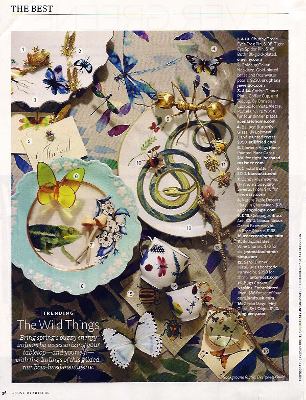
Although this image below from House Beautiful’s April issue promotes one of our favorite “Cote d’Azure” blues, we can’t help but notice the blue butterfly. Blue never goes out of style. It’s the color of sky and water and imbues a sense of serenity. It adds calm. We’re all about finding ways to de-stress thesse days! This color helps.

But how do you find your perfect interior design color? Besides the previously mentioned book, take this color quiz featured in TH Modern Classic Life (click to open in a new tab).
Traditional Home reminds us that going back to the basics with the Color Wheel Chart can always be helpful and worth reviewing. for what mood to you want to convey.

Yes, colors can vary and range so dramatically, which is why we’d like to mention two very different interior designers’ work featured in House Beautiful this month. The style they’ve created expresses the perfect colors for the spaces they are designing, each with a different sensation of color choices but each with a welcoming spirit.
Molly Luetkemeyer’s “Pursuit of Beauty” for her own Los Angeles home, knocks your socks off with a bold and beautiful jungle mural painted by Jeff Robinson. You can’t help but notice the similarity to Rousseau, which we appreciate. The colors throughout are jewel-like-gems that all reflect some aspects of Nature: greens, blues, floral reds and pinks, purples and a shot of yellow. Sounds like a good color drink for the bar cart above. The setting is lush as her garden, warm and inviting. We’ve always been taken with her down-to-earth yet high-end-dichotomy of style. Her concept to use her necklaces as an art wall is both practical and creative. She seems to always bring something fresh and new to the design table.
We can relate to her quote, “I wanted the white house with the white furniture and caramel throws, but I couldn’t do it.“

Equally as evocative is Frank de Biasi’s design for a client’s Manhattan apartment, with its sumptuous detailing. Although you wouldn’t think colors of Nature are necessarily predominant with its overall neutral palette; however, the leather-stitched library wall reminds one of a warm, inviting burled wood. The lovely Gracie wallpaper brings Nature indoors with its hand-painted flowering branches. We can’t help but think of our own Scenoiserie Collection with our Chinioiserie panels and Asia Blossoms that can transform any space with artistic wallpaper that has less cost, time to install and permanency.


Meanwhile, as you ponder the parameters of using color, which is only bound by your imagination btw, why not interject some small-scale colorful and artistic egg dying for your Easter celebration. Who knew adding fingernail polish could do such wonders?
Happy Easter!


Leave a Reply