
Today is the official first day of summer but the heat has already begun. We have a solution to help you beat the summer heat with cool wallcoverings that chill the temperature down with cool oriented colors.
The Spruce describes how cool colors produce this cooling effect and states their benefits:
Cool colors are typified by blue, green and light purple. They have the ability to calm and soothe. Where warm colors remind us of heat and sunshine, cool colors remind us of water and sky, even ice and snow. Unlike warm colors, cool colors look as though they recede, making them great for small rooms you want to appear larger. If you have a tiny bedroom or powder room that you want to visually enlarge, try painting a color such as light blue to make it seem more spacious…Can color really make you feel warmer or cooler? Sure it can, just like it can make a room appear brighter or darker. If you live in a climate that’s hot most of the year, you might prefer a decorating scheme that’s dominated by cool colors…To tone down a room that gets a lot of light, or to simply add contrast to the brightness, look to dark colors, whether warm or cool.
When you think of a cool temperature color, blue probably comes to mind. This is because blue is the coolest temperature color of the three primary colors.

Cool colors within this blue spectrum include the secondary colors green (blue + yellow) and purple (blue + red). Recalling basic color-theory, secondary “cool” colors are comprised of mixing the adjacent primary colors with blue. The tertiary or third-tier colors are formed by mixing secondary colors in equal parts (50:50) with primary colors or by mixing equal parts of two secondary colors. These would result in blue-green and blue-purple.

Now all these color hues come in varying degrees of saturation (intensity) by adding white (tint) or black (shade), which create different variations of these cool colors. Here’s a pretty cool visual from our print chart that shows some examples. This is just one sheet of many, by the way.

Now that we’ve covered the basics about what are cool temperature colors and why they affect our senses to experience a cooler temperature room, let’s see some cool interior design examples.
Here are two blues from the Mary Douglas Drysdale Signature Color Collection in a Colorwash design. These are also available in Faux Linen in a range of 15 colors.


Darker blues, as seen in these Lively Lattice and Groovy Gate designs from the Libby Langdon Collection create a sophisticated and fun interior using the style of accessories in which they are paired. When combined with white, these high-contrast colors appear crisp and clean and polished.

Simply paring cool colors with beach or sea-oriented accessories will strengthen the subconscious association with water and enhance the feeling of a cool temperature in the room.

The next example has more green hue added for a Van Gogh teal blue used for Casart Coverings’ Asia Blossom removable wallcovering.


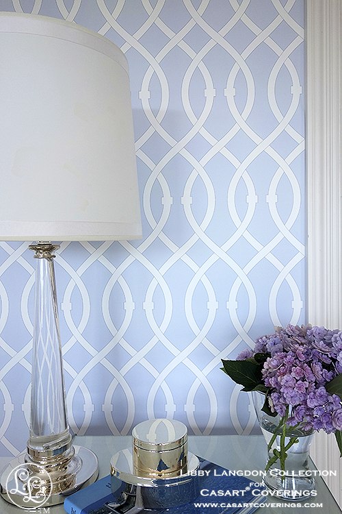
Libby Langdon’s Lively Lattice comes in a soft lavender blue (with red and blue tones and white). This color palette immediately cools down any room with its lighter shade.
We also have some cool-color green designs as seen with the Faux Padded Harlequin and Chevron and Lively Lattice, all in different versions of teal.


While we’re on the subject of cool, we love that you can get this look below with our Faux Glass Mosaic Tile design by simply peeling and sticking our wallcovering onto the stair riser.

Our Casart Coverings customer uses the teal Faux Mosaic Tile design in her bathroom because it is so durable.

Still hot? Think cool. Just looking at this painting by Josep Moncada may do it for you, just make sure you have a tall cool drink in hand while viewing. He has some beautifully cool paintings on his site.

Stay cool with the summer heat!
—–
If you’d like to further explore, here are some great reference sites:
• Click here if you want to learn more about color terms or print your own free color chart for reference at dreamhomedecorating.com.
• Timisha of Toolbox Divas explains the benefits of blue in her post, Monochrome Madness: Neverending Blues.
• Maverick & Blueberry has many examples and explanations about 37 Examples of Color Psychology on Room Interiors.


Leave a Reply