
There are many decorating fortune tellers out there but this foreshadowing for 2014 from JSonline Milwaukee Sentinel, has a nice assortment of ideas that you can pick and choose for your own decorating desires. As stated on this blog many times, we typically do not follow trends but we are interested in what people are interested in and what they are purchasing, as this is valuable information for any business owner for marketing reference. We pay attention but we don’t always follow suit.
The Journal Sentinal article mentions that current home decorating trends all encompass the 3 “R’s — not necessarily the ones we use, repositionable, removable and reusable but the…
Number 1) Trend is “Renew, Rejuvenate, Reinvigorate,” which are the key catch phrases. Well, “Reuse” that we tout is one of the “R’s” used in the similar sense that “Renew or Repurpose” is being tossed around as a trend to follow. It makes sense in precarious economic times to reuse what we have or repurpose it for another use. It also makes sense because it is practical. We love it because our wallcovering does just this and we are happy to comply. We’re also glad to try to get away from a “Throw Away” mentality, which can seem excessive and wasteful. Plus, it’s not so green and we try to be. Our print technology has changed too for our Casart Regular, to be more sensitive to a greener process. We are now using latex printing for our Casart Regular and continue to use eco-solvent inks for our Casart Light. Our materials are vinyl, not paper, which is extremely durable and long-wearing on your walls, as well as removable with their pressure-sensitive adhesive backings which adheres when pushed against a substrate but only sticks to the wallcovering when removed. As technology improves for better methods, so will our wallcovering.
Now let’s get to decorating.
Number 2) ” Kaleidescope of Color” abounds. Rather than neutral grays, bold pops of color are being used. Look at these examples and you might agree that this is more interesting than the same old boring beige.
Eileen Kathryn Boyd (EKB) Interiors – Kips Bay Showhouse. It was only added to OVER 13,000 ideabooks on Houzz!

EKB Interiors was recently featured in Luxe Magazine with this gorgeous dining room setting. Loving the purple, which is Eileen Kathryn Boyd’s signature color. It’s difficult to use such a range of purples with balance, but beautifully executed here.

Notice the place setting uses unconventional materials: an agate jewelery cuff as a napkin ring and the placemat and napkin were made with interior fabrics. She often uses wallcovering as table runners and placemats. Why not? We love that “out of the box,” creative thinking and multi-re-purpose use of wallcovering!

Another design example from InteriorDesign.net uses bold pattern and stripes to bring in bright color.

Mary Douglas Drysdale uses monochromatic bold color with sophisticated flair. Mary has also used unconventional materials and ways to display in her own design for place settings and “plate settings.”

Libby Langdon uses a bold Chic Chevron to catch your contemporary (Orange) Fire. Just that jolt of blue bringing up the floor color helps ground those zig-zags and sets the stage for a modern yet balanced composite.
Number 3) Walls can tell your story — it is predicted via this article that murals will become even more popular as a way to personalize your space. We can see this happening in residential spaces as well as commercial, in order to interject a unique personality to one’s room, as seen in Kristin Nicholas’ Garden of Family Farm Life Mural.

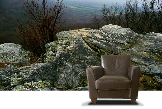
Number 4) Keeping it Natural – Natural and organic elements, such as wood, geodes, and stone are being incorporated into modern interiors. Perhaps this is a way of recalling our “roots” and reminding us of Nature and the outdoors, keeping us grounded, not so insular by being inside at all time with our technology. I would think, like number 3 suggests that this design concept could be incorporated with a photo mural, which also helps to personalize the space.


 Number 5) Lighten up with LED illumination. Alright, I don’t necessarily agree with this one, simply because LED lighting tends to make the room look cold — at least to me. But I do agree that lighting a room correctly, for function and ambient lighting can completely create or change the atmosphere of a room and set the mood.

Number 6) Furniture Forecast is Acrylic, Velvet, and Sustainable Eco-Friendly, as noted by designers, Bea Pila, Darlene Molnar, and Clint Parker.

Cococozy questions, “Would you Dare to be Different with a Blue Velvet Sofa?” with some great examples in their post.

Perhaps a “literal” take on “green.”

Number 7) Accessorizing can be Anything Goes. Again, making the space unique from displaying a Native American Collection to pops of color with pillows. Maintaining what makes the room appealing and using accessories to add personality is key. “Stone and stone veneers make for an interesting organic interior wall covering, says Debbie Wiener of My Designing Solutions.” I also like her Climbing Wall she designed. This definitely solves how to keep kids occupied.


Number 8) Clear the Clutter. Living the simplified life helps clear the mind and focus on the fundamentals. I agree with designer, Pablo Solomon’s philosophy, which is quoted here. He “sees a continuation of uncluttered, simple, practical, multifunctional and renewable designs. He recommends adopting the mantra “less is more” to focus on quality, not quantity, when it comes to art, rugs and furnishings.” Very coincidentally, we were featured in the same book by Melissa Kay Bishop.

An uncluttered design that incorporates bringing Nature indoors by iMatch Designs

Number 9) What’s Old is New Again. This (re)cycles back to #1 and the beginning of this post from the JSOnline Article that states repurposing items for renewal and reusability is the wave of the future.

— Ashley


Leave a Reply