

You may look at the title of this blog post and may be turning your head sideways or have a confused look on why dark colors could be the better choice to decorate a room. However, trust me, it will work out!
When people think of painting a room a certain color, they think of colors that will project a happy emotion. So, they use bright colors (like the one below) because people feel like this brings out positive vibes. With summer coming, a lot of people feel as if bright colors will reflect the weather and will somehow make the room more chilled. With bright colors, there comes this stigma that they are more inviting and welcoming, but I am here to tell you that is not always the case.

As an advocate and an enthusiast for dark colors, it is one of the better options. I say that because the color of the rooms in your house will reflect your personality. Each shade reflects a different mood and can come out in your personality. Each color that you choose can easily be matched to your personal desires. I know what you may be thinking, it’s summer now, so why would I need dark colors? Since it is so hot outside, the dark colors bring a more cooling effect to the room. The dark colors don’t reflect the weather and that can be a good thing. While it’s hot outside, when you walk into your room with the dark colors, you’ll feel engulfed with cool air.
The great thing about dark colors is that they can give an illusion that there is more space in the room. The colors blur the edges of the wall and also less light is reflective, so may think there’ a bigger space when it’s really not.
I’ve talked about the benefits of dark colors, but I haven’t really spoken about ways to style the room with dark colors.
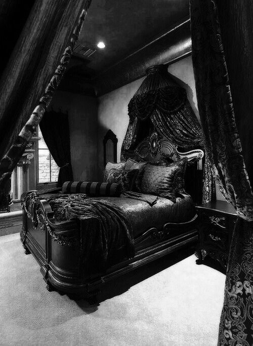
People usually shy away from dark colors such as navy, black, charcoal, or brown because they don’t know how to properly use them. My advice is not to go all dark like black-on-black or navy-on-navy like this picture below. Yes, I know this room looks a disaster — like sort of torture chamber.
You want a room that is dark but is still welcoming so I suggest a mixture of a dark and light color. Like some of the examples below, the dark color is heavily represented but balances out with the light color.
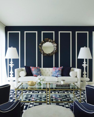
The navy is the core of the room, but balances with the white and is very welcoming.
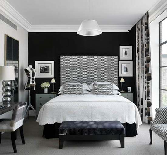
The black is what catches the eye, but with the white furniture and bedding, it’s more inviting.
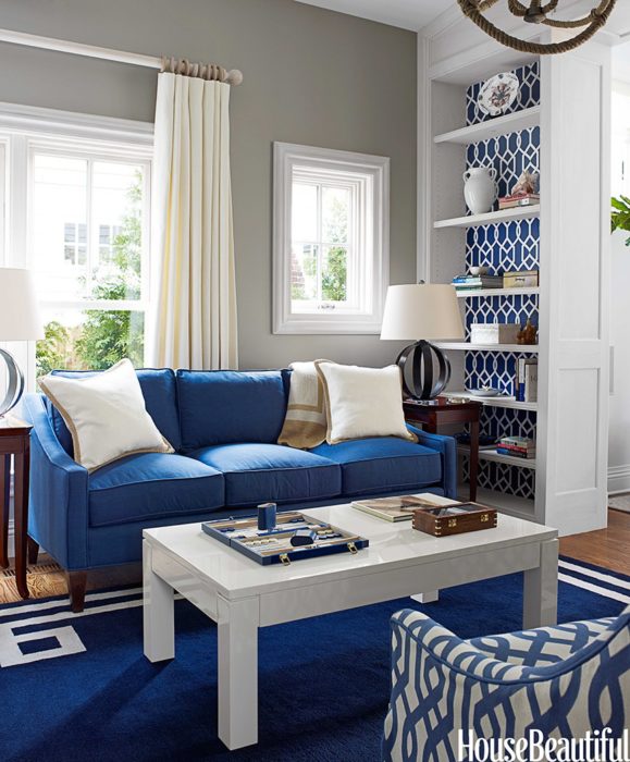
Another example is the blue and white wallpaper in the Groovy Gate design from the Libby Langdon Collection for Casart Coverings. The dark blue in the wallpaper enhances the blue sofa and white décor. The wallpaper is a nice blend of a blue and white with an invigorating pattern to help the room look welcoming.
Color choice is a personal matter, so choose a color that fits your personal needs and desires. I hope this post will help you consider expanding your options while using dark colors.


Leave a Reply