
Rooms in predominantly neutral shades or light tones are not dull. There, I said it! Now, here’s the proof.
This is a room by designer Mary McDonald as seen in the September House Beautiful. Be sure to follow the link for more lovely photos by Amy Neunsinger.

The McDonald- designed English-style bookcases in taupe have backings painted a pale blue. In the interview by David A. Keeps, Mary says, “I wanted it to be light but warm and pretty, so the entire palette was based around ivory, oatmeal, beige, gray, and taupe…” Her design mantra? “I went with a clean, modern California take on French country, with a teeny bit of industrial sparseness.”

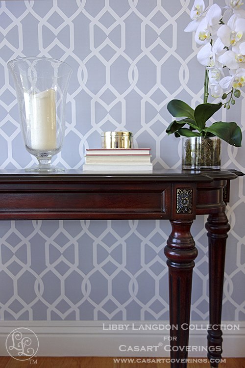
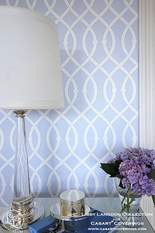
Groovy Gate in Steel Gray and Lively Lattice in Icy Blue, both from the Libby Langdon Collection for Casart, remind me of the geometric design of the bookcases. Many of our designs come in bookcase backing size which makes it a cinch to install or change the backings . Have you ever tried painting the backs of bookcases?!
For a sitting area off of the kitchen, McDonald chose stripes for the curtains and the slipper chairs paired with a chevron pattern engineered tile floor. “You can use a good stripe two ways; railroaded as a horizontal, which makes curtains zippy, and vertically on a traditional slipper chair. The width and tone of the stripe actually brings out the flavor of the floor.”
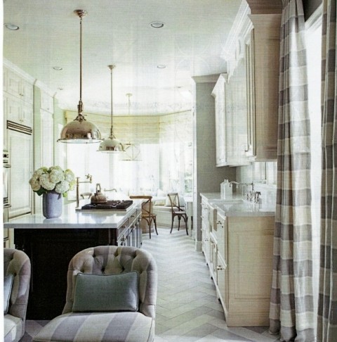
Here’s Libby’s Chic Chevron (but not in tile).
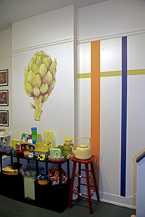
We don’t hesitate to use stripes at Casart: horizontally, vertically, and in any combination of sizes and colors. Okay, I’ll admit these are definitely not neutral, but I did want you to see how easy it is to install when you’re just using individual stripes and not having to tape, paint, allow to dry, remove tape, etc..

– Lorre Lei


Leave a Reply