
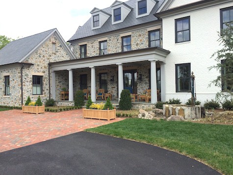
It was a pretty day last week to visit the DC Design House, benefiting Children’s Hospital. Fortunately, there is one more week, until May 10th, to make the worthwhile trip and discover a lot of useful decorating ideas.
The overall theme seemed to be Nature — bringing it indoors, back to basics, pairing down and the juxtaposition between textures with the mix of modern with traditional, e.g metal and wood.
This was immediately recognizable upon entering the first space, the living room designed by Annette Hannon. The beautiful cherry tree branches and blossoms were hand embroidered on silk wallcovering that enveloped over the fireplace and climbed up onto the ceiling. The blossoms shimmered with the filtered natural light streaming in from the windows. The colors were earth tones and set a peaceful, relaxed sense.

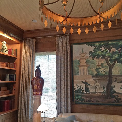
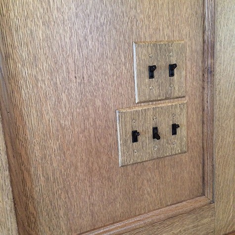
Michael Hampton’s Library design also used an au naturel, Nature theme with bleached-oak wood paneling throughout that was offset by the lightness of the faux bois fabric for the sofa, and carried linear stripes of the paneling via hand-painted paper onto the ceiling. These elements with glitters of gold from the chandelier and green floral design over a white ground for the drapes kept the space from feeling too heavy or dark but maintained the rich, exotic quality. The Chinoiserie landscape painting tied all the colors and elements together and also served as a focal point. No details were overlooked. Even the switch plate covers were treated with a faux bois finish to blend in with the real wood paneling. You may be lucky as we were to speak with the designer, who was there for a time while we were visiting. Many of the designers or their representatives were in their rooms to answer questions.

Moving into the gallery, one could not help but notice the balance of the hard and soft surfaces between the flagstone wall and grasscloth wallpaper on the ceiling. In fact throughout the showhouse, the ceiling was more often than not decorated as the 5th wall, and often with wallpaper, which I was excited to see.
This was very noticeable in Jeff Akseizer and Jamie Brown’s design for the dining room as well as the gallery. Birch tree branches lined the sections of the ceiling and created a beautifully textured balance with the modern metal chandelier. The wallpaper was grasscloth again but with a gorgeous hand-woven pattern. The drapes were a silken, light faux bois and the metal chairs were upholstered in fur. What a sensory mix of textures and styles.


We approached the upstairs by passing back through the foyer and up through the stairwell both designed by Pamela Harvey with rich patterns. The most noticeable element in the upstairs landing was this gorgeous albino peacock portrait. Not only Nature but her creatures were also brought into the decoration.

The first room on the second level was the bedroom designed by Scott Cooke. It just took your breath away with the stunning, highly-textured, faux bois wallpaper that was simultaneously sumptuous and down to earth — literally with the appearance of tree bark. Scott had designed this space as the “Gentleman’s Retreat” but it could equally be enjoyed by anyone because it was so elegant, understated yet simply refined. It was a perfect monochromatic mix of modern with antique furnishings. The peaceful color was punctuated with pops of red leafed prints set in separate layouts to form one image. Even the Gaelic background music by Loreena McKennitt helped to set the lush Nature theme. Beautifully done, Scott, and congratulations!

The first thing you noticed in the nursery, designed by Nancy Twomey of Finnian Interiors and Finnian Moon, a shop right down the street from me in Old Town, Alexandria VA, is the doe-eyed deer print staring at you as if you found Bambi in the woods. The off-center framing gave it a hip modern feel, as if this fawn was peering in from a window — bringing the outdoors in, while maintaining the pure sweetness one expects to see in a baby’s room. This main accent wall was the focal point with textured light-blue linen wallpaper that balanced with a pink and pastel palette. I was most taken with the feather chandelier and I’m on a hunt to gather materials to make my own someday. Again, different textures were used and the ceiling was not left out. It was painted a soft pink.

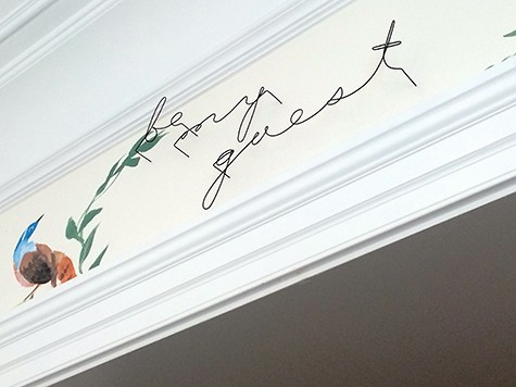
Passing through the upstairs gallery was no quick jaunt. The beautifully painted mural that simulated the look of hand-painted wallpaper in Christopher Nutter’s design, stopped you in your tracks to take a closer look. There were so many details that made all the difference in his Bunny Williams inspired room, from butterflies galore (my favorite) to metal wire script stating “be my guest” over the pass through was both a whimsical welcome and trompe l’oeil detail. It looked hand written from a distance but was clearly 3-dimenisonal as you gazed up while standing underneath. This concept of fooling the eye abounded in this year’s Design House. Things were not always as they seemed. The concept of texture, as in wood for instance, was used in so many unusual ways: on walls, ceilings, in upholstery and drapes. There were other organic touches in Christopher’s room like blue agate coasters to play up the brilliant, deep cerulean blue that was used throughout. Christopher had done some work with Casart coverings before so I was pleased to see his overall design concept was “to make the walls art,” something we aspire to do as well. Congratulations, Christopher on a detailed design well done!
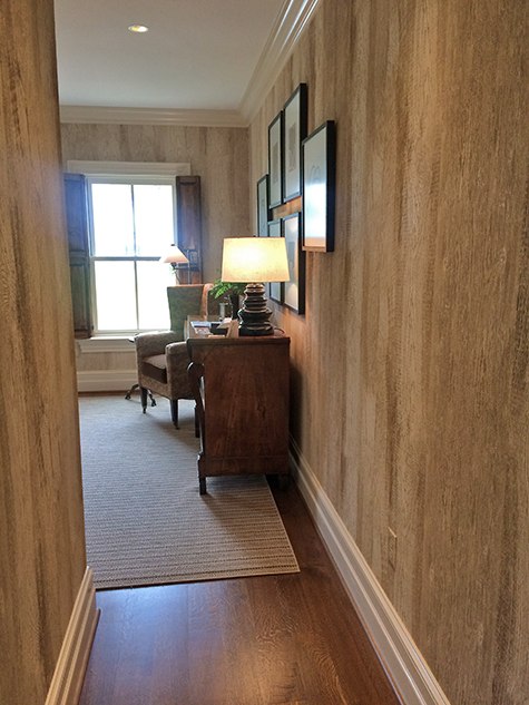
Going down the back stair hall there was yet another example of wallpaper in David Benton’s design. A window to the outside was virtually incorporated in the Old Dominion Sky painting. The wood looking rug was actually made of leather strips on their side bound together.

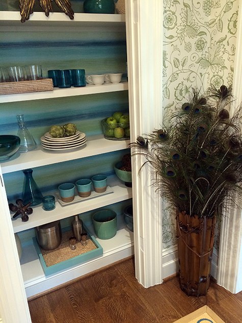
Margery Wedderburn’s design for the butler’s pantry was one of my favorites because I like blue and green together. She used the combination in an ombré wallpaper that lined the backs of the cupboard shelving which added visual interest to the dishware and accessory pieces. Wallpaper was also used on the walls as was a lovely faux bois paper on the ceiling.


I adored the porcupine quill mirror in the Art Aficionado Lounge designed by Terri Pakravan of Decor Dose. I had never seen the quills used this way when I was more familiar with Native American hand-woven quill boxes, which are so intricate and cost a small fortune. This was equally as fabulous.
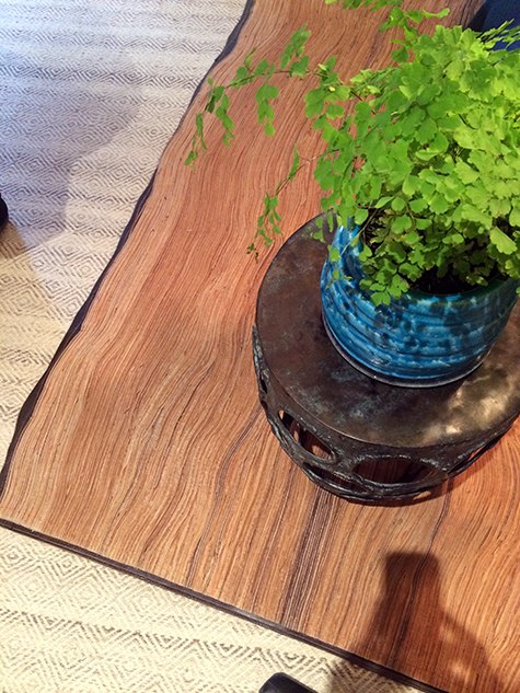
There was also the use of hard and soft textures as well as the difference between Nature and the most recent bowed-edge, high-tech, television technology used in Samantha Friedman’s lower level den. Textured wallpaper on the walls, faux shagreen nesting tables as well as a soft, wooly alpaca chair all added to the Nature, mixed-texture theme.

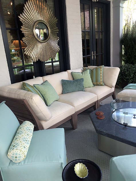
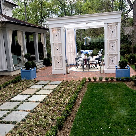
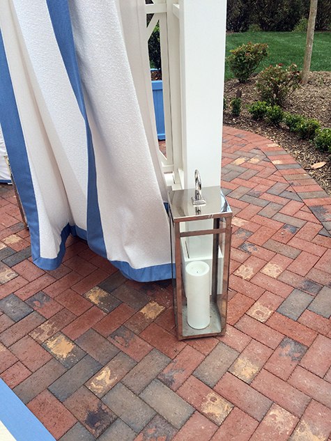
Seeing the loggia designed by Nancy Colbert and outdoor patio by Skip Sroka was a real treat. My favorite colors as well as a mixture of textures were used in each. Cool colors set against warm brown furniture and a bold beautiful starburst mirror was featured in the loggia and heavyweight white, almost terry-cloth, thick draperies were used over a white wooden frame with a dark metal and glass table and metal chairs were used to create an inviting al fresco sitting area on the patio. The tall, shiny silvery lanterns added a modern touch.

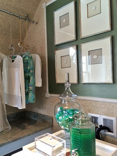
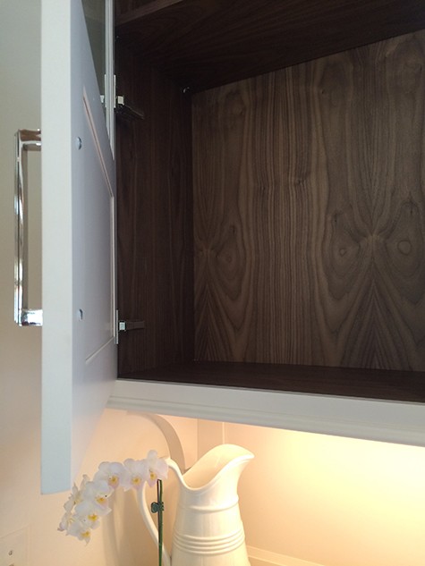
There were so many take-aways from this design show house: mix of textures showed new ways to view artwork by framing a cutout piece over a mirror, using bangle bracelets to hang garments as a dry rack, using juice decanters as soap dispensers, create lighting with mason jars, add a new look to glass kitchen cabinets by lining them with faux bois wallpaper.

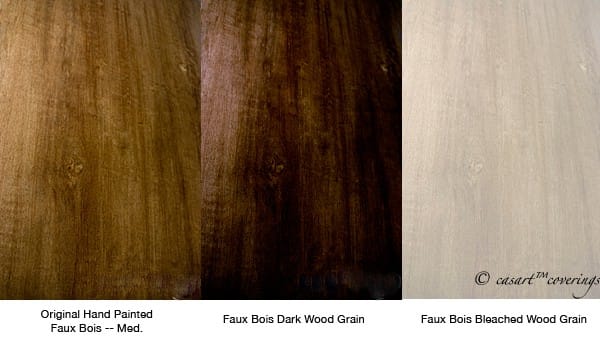
These are other possible Casart faux bois versions in our Organics Collection:
The main take away, don’t be afraid to use the unexpected. For instance, make it interesting with metal and wood or pair Nature with Industrial. Mix it up and use it together. Blend while keeping it simply au naturel.


Leave a Reply