When Mary Douglas Drysdale is gracious enough to give her interior design decorating tips, we ALL listen! Traditional Home has capitalized on Mary’s exceptional skill by offering a design “training camp” of sorts, in which anyone can sign up for a 15 week course to learn tips from the top designers, including Mary. What a fabulous opportunity and a great way to enjoy summer camp!

Mary has the innate ability to be able to combine traditional with contemporary design for a timeless effect. I don’t want to give it all away here but here is a summary of Mary’s design tips mentioned on Traditional Home’s online site:
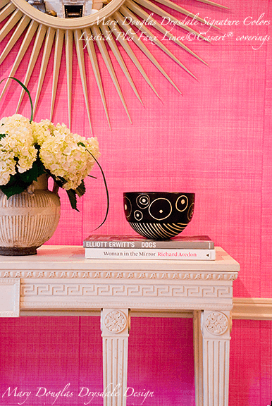
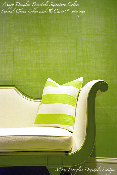
1) Use Bold Color
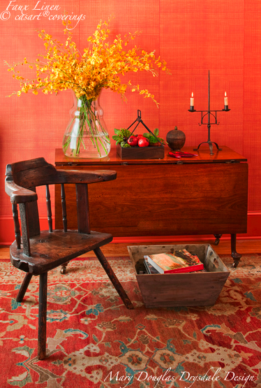
• I have found it much easier to use strong, saturated colors if I focus on one hue and use it liberally to cover many surfaces
• Classical plans work well with lively color expression…because the classical approach to design relies on symmetry, balance, and strong axial relationships.
• If you think of color as energy, it is better expressed and viewed when the color is balanced in the room without other strong color distractions.
2) Frame the View
• Openings from room to room are most graceful when they accomplish two things.
• An opening should share a strong relationship with other openings within the space.
• And the view beyond the opening should be interesting and framed well.
3) Consider Millwork and Furniture Together
• Millwork adds detail and interest to most any room.
• But when adding millwork or paneling to a wall, it is important to consider how the furniture to be placed in front of that wall will share the space.
4) Respect the Underpinnings of Classical Design
• Remarkable beauty is expressed when the principles of classical design are used successfully.
• But when they are not, a project may communicate awkwardness and an amateur’s eye.
5) Welcome Color in the Kitchen
• Unexpected color can transform a kitchen into a much more charming and inviting place in which to spend time.
• A painted kitchen also feels less utilitarian.
• Yellow is a particularly lovely choice and works so well with blue-and-white china.
6) Paint a Floor in Lieu of a Rug
• Painting or patterning a floor is a terrific solution, because the floor covering can be made to fit the dimensions of any room!
• The key to the success of any scheme is working out the layout before any painting is done.
• Testing and approving colors before painting begins is also essential.
7) Glamourize the Bathroom
• I love to include paneling in bathrooms.
• Classical moldings add richness and balance to the room.
• The bathroom should express the mood and tenor of the rest of the architecture of the house.
8) Choose Furniture That Multi-Tasks
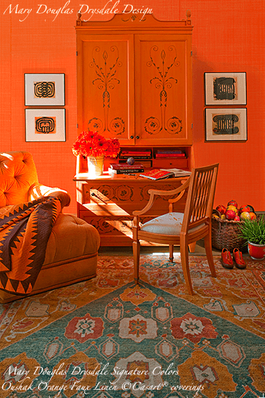
• My absolutely favorite piece of furniture is the traditional secretary.
• This piece of furniture is like the best assistant or teammate one ever had. The secretary multi-tasks beautifully.
• In my view the secretary is the absolute expression of “useful beauty.”
9) Include Art in Every Room
• There is no room in a house that does not benefit from displaying art.
• Indeed, the balance of art, architecture, and decoration is at the foundation of the way I approach design.
10) Warm Up a White Room
• I prefer to use broken whites (toned-down whites) and always try to make warm, soft and inviting white spaces.
• Warm white rooms eat up these gestures that might be too much when used together in a vivid color.
• I also find white flowers in a white room charming.
11) Revive Grandma’s Furniture
• I often think that my rooms are places where the past meets the present.
• You can mix reflections of old and new in many ways.
• I like to pair vintage furnishings that look dated (as they are) with colorful and patterned textiles.
12) Start with a Patterned Rug
• Decorative scheme starts with what I call a “driver,” or the element in a room around which the rest of a decorative scheme is built.
• Patterned rugs, and especially bold polychrome Orientals (such as my favorite, the Oushak)…
• Extracting a single rich color from a rug for the major furniture surfaces is preferable to using too many contrasting colors.
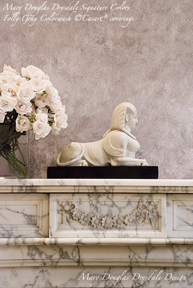
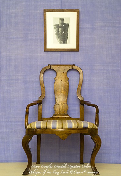
There are plenty more details and visual examples that I haven’t disclosed. Click here to read more…or better yet, to sign up for the Master Class to get personal assistance from Mary Douglas Drysdale, the design maven, herself. Feel free to view all her Signature Colors (some as seen above) for Casart’s repositionable wallcoverings as well.
— Ashley







Leave a Reply